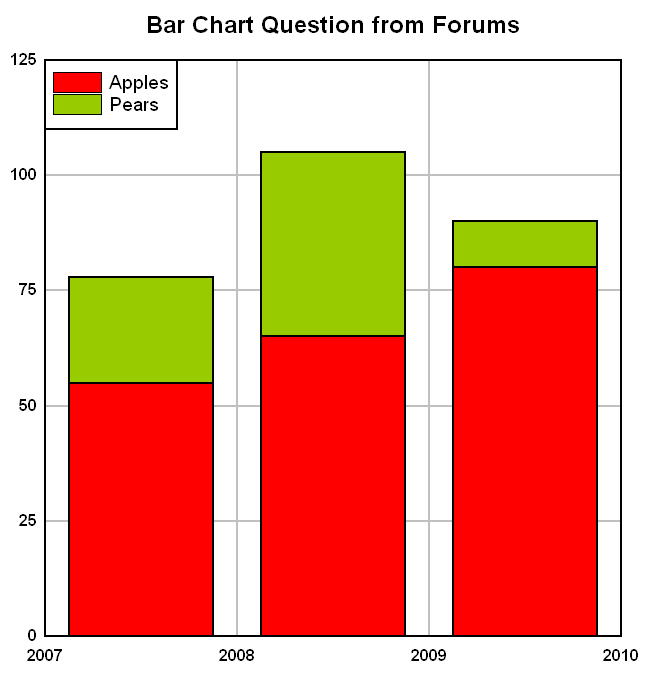
Eg.
Code: Select all
x-axis     Series   y-axis

Apples      2007       55
            2008       65
            2009       80
Pears       2007       23
            2008       40
            2009       10
Using the standard bar chart (dp.dataformat = %DATA_DXY, dp.scalecode = %SCALE_BARCHART), each of the x categories would be a separate curve, so difficult to see how it could contain values from different series.
Of course the whole thing could be done artificially with adjusted x-values and some control of the colour of the bars, but Excel and other graph packages do support multiple series more easily.
Any help gratefully received.
Peter


