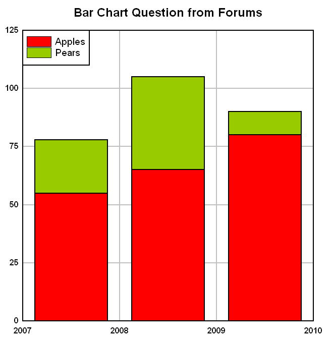
Data series for bar charts

Beta releases, announcements and anything else that doesn't fit below. Please read the <B>Welcome</B> topic.

Moderator: DPlotAdmin

Post Reply
Peter Simmonds
Posts: 18
Joined: Sat Mar 12, 2005 3:27 am
Location: Edinburgh, Scotland

Data series for bar charts

Post by Peter Simmonds »

Very sorry if this has already been covered or explained somewhere, but how can I plot multiple data series as a bar chart?

Eg.

Code: Select all

x-axis     Series   y-axis

Apples      2007       55
            2008       65
            2009       80
Pears       2007       23
            2008       40
            2009       10
So ideally, two x categories, each with three bars clustered together representing different years.

Using the standard bar chart (dp.dataformat = %DATA_DXY, dp.scalecode = %SCALE_BARCHART), each of the x categories would be a separate curve, so difficult to see how it could contain values from different series.

Of course the whole thing could be done artificially with adjusted x-values and some control of the colour of the bars, but Excel and other graph packages do support multiple series more easily.

Any help gratefully received.

Peter
User avatar
DPlotAdmin
Posts: 2312
Joined: Tue Jun 24, 2003 9:34 pm
Location: Vicksburg, Mississippi
Contact:

Post by DPlotAdmin »

I'm not sure I understand your question, but it sounds like you may be getting confused by this being a bar chart. But the process is the same for a line graph. This code:

Code: Select all

			NP = 3;
			x[0]=1;
			x[1]=2007;
			y[0]=55;
			y[1]=65;
			y[2]=80;
			y[3]=23;
			y[4]=40;
			y[5]=10;
			memset(&DPlot,0,sizeof(DPlot));
			DPlot.Version = DPLOT_DDE_VERSION;
			DPlot.DataFormat = DATA_DXY;
			DPlot.MaxCurves = 2;	// Must be >= number of curves we plot
			DPlot.MaxPoints = NP;	// Anything >= NP will do
			DPlot.NumCurves = 2;
			DPlot.Scale = SCALE_BARCHART;
			DPlot.NP[0] = NP;
			DPlot.NP[1] = NP;
			strcpy(DPlot.Legend[1],"Apples");
			strcpy(DPlot.Legend[2],"Pears");
			strcpy(DPlot.Title[0],"Bar Chart Question from Forums");
			DocNum = DPLOT_PLOT(&DPlot,x,y,
				"[Caption(\"Bar Chart Question from Forums\")][BarChartStyle(3)]");
... produces this plot:

Image

Is this what you're hoping for?
Visualize Your Data
support@dplot.com
Peter Simmonds
Posts: 18
Joined: Sat Mar 12, 2005 3:27 am
Location: Edinburgh, Scotland

Post by Peter Simmonds »

Thanks, almost what I had intended, but i Had wanted the bars of different series plotted side by side. Here is the intended graph in Excel based on the following spreadsheet:

Code: Select all

Fruit	2007	2008	2009
Apples	55	65	80
Pears	23	40	10
Image
Peter Simmonds
Posts: 18
Joined: Sat Mar 12, 2005 3:27 am
Location: Edinburgh, Scotland

Post by Peter Simmonds »

Just as a footnote, using the data table in the previous post, I can draw the following graph through the Excel DPlot add-in using the bar chart - data in rows menu option. It's not exactly what I want but can't get the data to group the other way.

Image
User avatar
DPlotAdmin
Posts: 2312
Joined: Tue Jun 24, 2003 9:34 pm
Location: Vicksburg, Mississippi
Contact:

Post by DPlotAdmin »

Just reorder the Y values into 3 curves w/ 2 points each. You'll have to jump through a few hoops (as the Add-In does) to get the X axis labels like you want:

Code: Select all

	NP = 2;
	x[0]=1;
	x[1]=0;
	y[0]=55;
	y[1]=23;
	y[2]=65;
	y[3]=40;
	y[4]=80;
	y[5]=10;
	memset(&DPlot,0,sizeof(DPlot));
	DPlot.Version = DPLOT_DDE_VERSION;
	DPlot.DataFormat = DATA_DXY;
	DPlot.MaxCurves = 3;	// Must be >= number of curves we plot
	DPlot.MaxPoints	= NP;	// Anything >= NP will do
	DPlot.NumCurves = 3;
	DPlot.Scale = SCALE_BARCHART;
	DPlot.NP[0] = NP;
	DPlot.NP[1] = NP;
	DPlot.NP[2] = NP;
	strcpy(DPlot.Legend[1],"2007");
	strcpy(DPlot.Legend[2],"2008");
	strcpy(DPlot.Legend[3],"2009");
	strcpy(DPlot.Title[0],"Bar Chart Question from Forums");
	DocNum = DPLOT_PLOT(&DPlot,x,y,
		"[Caption(\"Bar Chart Question from Forums\")]"
		"[BarChartStyle(1)][BarWidth(1,0.75)]"
		"[XYLabel(0.5,0,0,\"Apples\")]"
		"[XYLabel(1.5,0,0,\"Pears\")]"
		"[NumberFormat(0,12)]");
Image
Visualize Your Data
support@dplot.com
Peter Simmonds
Posts: 18
Joined: Sat Mar 12, 2005 3:27 am
Location: Edinburgh, Scotland

Post by Peter Simmonds »

Brilliant, thanks very much. No problem converting the code.

Best wishes

Peter
Post Reply