Page 1 of 1
Data series for bar charts
Posted: Mon Aug 23, 2010 1:39 pm
by Peter Simmonds
Very sorry if this has already been covered or explained somewhere, but how can I plot multiple data series as a bar chart?
Eg.
Code: Select all
x-axis     Series   y-axis

Apples      2007       55
            2008       65
            2009       80
Pears       2007       23
            2008       40
            2009       10
So ideally, two x categories, each with three bars clustered together representing different years.
Using the standard bar chart (dp.dataformat = %DATA_DXY, dp.scalecode = %SCALE_BARCHART), each of the x categories would be a separate curve, so difficult to see how it could contain values from different series.
Of course the whole thing could be done artificially with adjusted x-values and some control of the colour of the bars, but Excel and other graph packages do support multiple series more easily.
Any help gratefully received.
Peter
Posted: Mon Aug 23, 2010 2:53 pm
by DPlotAdmin
I'm not sure I understand your question, but it sounds like you may be getting confused by this being a bar chart. But the process is the same for a line graph. This code:
Code: Select all
			NP = 3;
			x[0]=1;
			x[1]=2007;
			y[0]=55;
			y[1]=65;
			y[2]=80;
			y[3]=23;
			y[4]=40;
			y[5]=10;
			memset(&DPlot,0,sizeof(DPlot));
			DPlot.Version = DPLOT_DDE_VERSION;
			DPlot.DataFormat = DATA_DXY;
			DPlot.MaxCurves = 2;	// Must be >= number of curves we plot
			DPlot.MaxPoints = NP;	// Anything >= NP will do
			DPlot.NumCurves = 2;
			DPlot.Scale = SCALE_BARCHART;
			DPlot.NP[0] = NP;
			DPlot.NP[1] = NP;
			strcpy(DPlot.Legend[1],"Apples");
			strcpy(DPlot.Legend[2],"Pears");
			strcpy(DPlot.Title[0],"Bar Chart Question from Forums");
			DocNum = DPLOT_PLOT(&DPlot,x,y,
				"[Caption(\"Bar Chart Question from Forums\")][BarChartStyle(3)]");
... produces this plot:
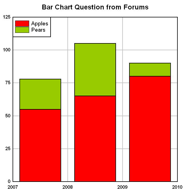
Is this what you're hoping for?
Posted: Tue Aug 24, 2010 3:23 am
by Peter Simmonds
Thanks, almost what I had intended, but i Had wanted the bars of different series plotted side by side. Here is the intended graph in Excel based on the following spreadsheet:
Code: Select all
Fruit	2007	2008	2009
Apples	55	65	80
Pears	23	40	10

Posted: Tue Aug 24, 2010 3:33 am
by Peter Simmonds
Just as a footnote, using the data table in the previous post, I can draw the following graph through the Excel DPlot add-in using the bar chart - data in rows menu option. It's not exactly what I want but can't get the data to group the other way.

Posted: Tue Aug 24, 2010 7:12 am
by DPlotAdmin
Just reorder the Y values into 3 curves w/ 2 points each. You'll have to jump through a few hoops (as the Add-In does) to get the X axis labels like you want:
Code: Select all
	NP = 2;
	x[0]=1;
	x[1]=0;
	y[0]=55;
	y[1]=23;
	y[2]=65;
	y[3]=40;
	y[4]=80;
	y[5]=10;
	memset(&DPlot,0,sizeof(DPlot));
	DPlot.Version = DPLOT_DDE_VERSION;
	DPlot.DataFormat = DATA_DXY;
	DPlot.MaxCurves = 3;	// Must be >= number of curves we plot
	DPlot.MaxPoints	= NP;	// Anything >= NP will do
	DPlot.NumCurves = 3;
	DPlot.Scale = SCALE_BARCHART;
	DPlot.NP[0] = NP;
	DPlot.NP[1] = NP;
	DPlot.NP[2] = NP;
	strcpy(DPlot.Legend[1],"2007");
	strcpy(DPlot.Legend[2],"2008");
	strcpy(DPlot.Legend[3],"2009");
	strcpy(DPlot.Title[0],"Bar Chart Question from Forums");
	DocNum = DPLOT_PLOT(&DPlot,x,y,
		"[Caption(\"Bar Chart Question from Forums\")]"
		"[BarChartStyle(1)][BarWidth(1,0.75)]"
		"[XYLabel(0.5,0,0,\"Apples\")]"
		"[XYLabel(1.5,0,0,\"Pears\")]"
		"[NumberFormat(0,12)]");

Posted: Tue Aug 24, 2010 7:16 am
by Peter Simmonds
Brilliant, thanks very much. No problem converting the code.
Best wishes
Peter